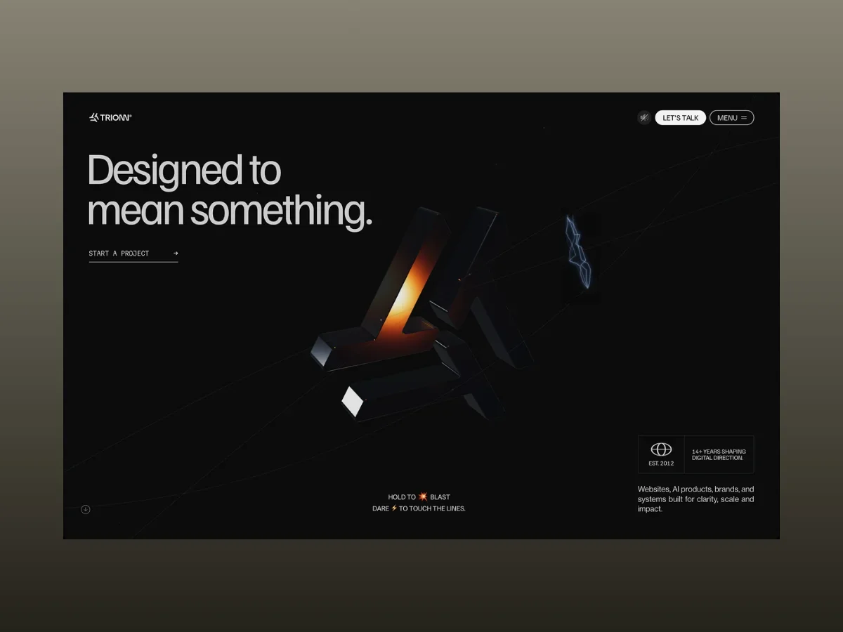
The creation of Trionn serves as a testbed for pushing the boundaries of web design, merging elements of animation, WebGL, and user interaction into a singular cohesive experience. After extensive experimentation and refinement, the project achieved a synthesis of GSAP, Three.js, Lenis, and custom Web Audio interactions to deliver a dynamic digital interface, where each segment operates on its own specialized system.
This initiative unfolded over several iterations, transforming initial ideas into a well-integrated framework. The features—ranging from the hero section and scroll-driven narratives to procedural graphics and real-time effects—were developed not as standalone components but as part of an interconnected animation ecosystem.
Spanning four months of rigorous development, Trionn gained accolades from notable platforms such as FWA, GSAP, Orpetron, CSS Design Awards, Web Design Awards, CSS Winner, and a variety of international design showcases. More significantly, this journey illuminated key technical considerations surrounding performance, synchronization, and interaction design.
In this analysis, we'll dissect the architecture powering Trionn, providing insights into its animation systems, WebGL techniques, optimization tactics, and code methodologies that contributed to realizing this sophisticated experience.
Technical Overview
Creating a site teeming with intricate animations demands a careful balance between creative ambition and execution efficiency. Each technology employed within the stack has a distinct role, effectively managing everything from animations and scrolling interactions to rendering WebGL scenes and producing audio in real-time.
The backbone of the project is constituted by:
- GSAP + @gsap/react for handling timelines, page transitions, and animations at the component level.
- ScrollTrigger for managing scroll-dependent reveals, pinned sections, and scrubbing animations.
- SplitText for enabling reusable animations at the character, word, and line levels.
- Three.js for delivering the hero symbol, Services section, and interactive work grid.
- Lenis for facilitating smooth scrolling in harmony with GSAP.
- Web Audio API for crafting interactive audio effects in real time.
- Next.js and React for the application framework.
- Tailwind CSS for styling and layout.
- Swiper for implementing testimonials and award carousels.
GSAP serves as the nucleus of the animation framework. Page transitions, scroll-triggered sequences, pinned sections, and component-specific animations are all structured around GSAP timelines, aided by <a href="https://gsap.com/resources/React/">useGSAP</a>, which streamlines setup and cleanup processes as components mount and unmount within Next.js.
ScrollTrigger is essential for orchestrating the scroll mechanics across the site, ranging from pinned storytelling areas to animations that scrub and reveal as users navigate. Additionally, we exploit gsap.matchMedia() to tailor animation logic for both desktop and mobile layouts, allowing for distinct interactions tailored to each environment.
The text animations relied on a reusable BlurTextReveal component constructed with SplitText, accommodating character, word, and line animations while effectively handling situations like reduced-motion preferences, GPU layer maintenance, and ScrollTrigger refreshes without necessitating a separate solution for each heading.
For dynamic WebGL experiences, we opted for Three.js, deliberately steering clear of React Three Fiber to maintain greater control over rendering processes, resource management, and the intricately animated mesh panels of the hero symbol.
Lenis is directly integrated with gsap.ticker, ensuring seamless synchronization of scrolling effects with the animations facilitated by ScrollTrigger across the entire site.
Rather than relying on pre-recorded audio files, interactive sound effects—such as those deployed during the hero hover and weld interactions—are orchestrated in real-time using the Web Audio API.
The Hero Section
The hero section underwent significant evolution throughout the project timeline. It fuses elements of WebGL, GSAP, SplitText, and the Web Audio API into a unified interaction architecture, marking it as one of the more technically complex aspects of the site.
Composed of two layered visuals sharing a common state, the background features a singular Three.js scene (useTrionnSymbolScene.ts) that drives the brand's symbol—integrating idle animations, hover responses, blast interactions, and spark effects—all regulated by a single explodeAmt variable. This design ensures that whether the user scrolls, hovers, or presses down, the transitions among states occur smoothly and cohesively.
The foreground incorporates standard DOM elements—such as the headline, rotating text, and statistical hints—animated via GSAP and SplitText. Utilizing regular HTML ensures accessibility while the mix-blend-mode: difference CSS mask guarantees visibility against the dynamic WebGL background.
Synchronization across both layers is facilitated through a shared transitionReady flag, which dictates that animations are only activated post-page transition, with less critical tasks being deferred via requestIdleCallback to maintain performance during the initial loading stage.
Hero Headline Reveal
Upon loading the page, the hero headline (“Designed to”) emerges character by character, transitioning through a blur-to-sharp effect. Instead of a mundane fade-in, this meticulous approach provides a more engaging introduction to the content.
// components/Sections/Home/Banner.tsx — usage
<BlurTextReveal
  as="h1"
  text="Designed to"
  animationType="chars" // split per-character, not word/line
  stagger={0.08}
  delay={1.2} // waits for the page loader/transition to clear first
/>

// components/TextAnimation/BlurTextReveal.tsx — the engine behind it
const split = new SplitText(textRef.current, {
  type: "chars, words, lines",
  smartWrap: true,
});

const targets = split.chars; // animationType === "chars"

gsap.set([textRef.current, targets], {
  autoAlpha: 0,
  filter: "blur(12px)",
  willChange: "filter, opacity", // promote to its own GPU layer only while animating
});

const tl = gsap.timeline({
  paused: manual,
});

tl.to(textRef.current, {
    autoAlpha: 1,
    filter: "blur(0px)",
    duration: 0.5,
  }, delay)
  .to(targets, {
    autoAlpha: 1,
    filter: "blur(0px)",
    duration: 0.8,
    stagger: {
      each: 0.08,
      from: "random",
    }, // characters settle out of order
    ease: "power2.out",
  }, delay);
Implementing filter: blur() in tandem with opacity creates a visual experience where the text seems to come into focus instead of merely fading in. Following the animation's conclusion, the will-change property is removed to prevent the text from occupying a dedicated GPU layer beyond its initial animation period. This same BlurTextReveal component is employed throughout the site for the rotating word and the statistics hint but configured with varying animation parameters.
Hero Symbol: Idle State
When idle, the hero symbol exhibits continuous rotation, while each arm undergoes a subtle sine-wave motion with independent phase offsets. This design choice steers clear of a mechanical feel, promoting a more organic movement.
// hooks/useTrionnSymbolScene.ts — per-frame update loop

// Auto-rotate: a constant rotational drift, eased toward the mouse position
if (!st.dragging) {
  st.rotY += prefersReducedMotion ? 0.0015 : 0.0042; // base spin speed
  st.rotX = Math.max(-Math.PI / 2, Math.min(Math.PI / 2, st.rotX));

  group.rotation.x +=
    (st.rotX + mouse.y * 0.22 - group.rotation.x) * 0.06; // eased lerp
  group.rotation.y +=
    (st.rotY + mouse.x * 0.22 - group.rotation.y) * 0.06;
}

// Per-panel ambient drift — each of the 3 arms gets its own phase offset
// so the whole symbol doesn't breathe in lockstep
particles.forEach((p) => {
  const phase = p.shapeIdx * (Math.PI * 2 / 3); // 0°, 120°, 240°

  const armDriftX =
    Math.sin(t * 0.4 + phase) * 0.012 * (1 - explodeAmt);
  const armDriftY =
    Math.cos(t * 0.35 + phase) * 0.008 * (1 - explodeAmt);
  const armDriftZ =
    Math.sin(t * 0.3 + phase * 1.5) * 0.006 * (1 - explodeAmt);

  // ...position += drift, scaled down to 0 the moment any explode/hover state kicks in
});
When the prefersReducedMotion option is activated, the rotation speed decreases rather than ceasing entirely. The mouse movement applies through linear interpolation (lerp), lending the symbol a cohesive, magnetic quality instead of rapid cursor matching. Additionally, ambient drift is modulated by (1 - explodeAmt), allowing it to taper off naturally as user actions shift the state.
Hero Symbol: Magnetic Hover
Upon cursor hovering over the symbol, the corresponding panel gets a brief charge-up effect, growing brighter and more reflective, accompanied by a subtle beep the first time the cursor hovers over that segment. Using raycasting for hover detection, as opposed to simple CSS, allows the interaction to be significantly more responsive to the symbol’s actual 3D form as it rotates.
// hooks/useTrionnSymbolScene.ts — hover detection via raycasting

const raycaster = new THREE.Raycaster();

// Per frame: only check for hover when the symbol is fully assembled
// (not mid-explode, not scrolled away, not in the intro animation)
if (
  st.mouseScreenX !== -9999 &&
  st.scrollProgress < 0.08 &&
  st.clickBurst < 0.05 &&
  st.introAmt < 0.08
) {
  raycaster.setFromCamera(mouse, camera);

  const hits = raycaster.intersectObjects(
    particles
      .filter((p) => !p.isEdge)
      .map((p) => p.mesh as THREE.Mesh),
    false,
  );

  const nowHit = hits.length > 0 ? hits[0].object : null;

  if (nowHit !== st.hoveredMesh) {
    if (nowHit) {
      const hm = nowHit as THREE.Mesh & {
        _flash?: number;
        _flashActive?: boolean;
      };

      hm._flash = 1.0; // triggers the charge-up below
      hm._flashActive = true;

      audio.playHoverBeep(); // only fires on a new panel, not every frame
    }

    st.hoveredMesh = nowHit;
  }
}

// Elsewhere: decay the flash and ramp the material toward its "charged" look
mesh._flash = (mesh._flash || 0) * 0.92; // exponential decay each frame

const f = mesh._flash;

mat.envMapIntensity = 3.0 + f * 1.6; // brighter reflections
mat.clearcoatRoughness = Math.max(0.01, 0.05 - f * 0.035);
mat.transmission = 0.35 + f * 0.32; // more "glassy"
Utilizing raycasting against the geometry of the symbol fundamentally enhances the hover effect’s accuracy and responsiveness. Each panel’s highlight diminishes independently with an exponential decay factor, avoiding the need for a distinct GSAP tween for each 3D mesh element.
Hero Lines: Weld Spark Effect
When the page initially loads, three guide lines animate outward from the symbol. Upon completion of this animation, hovering over any of these lines produces a burst of spark-like effects that arc towards one or two of the remaining lines, echoing the prompt: “Dare ⚡ to touch the lines.”
// hooks/useTrionnSymbolScene.ts

// Sparks are only enabled once the guide lines have finished drawing
const baseLinesReadyForSpark =
  inS1 &&
  undrawAmt < 0.02 &&
  st.lineState.every((s) => s.prog >= 0.995);

if (baseLinesReadyForSpark) {
  // Hit-test the mouse against all 3 line paths (14px tolerance)
  const allLinePts = [ptsL, ptsR, ptsB];

  let hitResult: { x: number; y: number } | null = null;
  let hitLineIdx = -1;

  for (let li = 0; li < allLinePts.length; li++) {
    const h = mouseNearLine(allLinePts[li], 14);

    if (h) {
      hitResult = h;
      hitLineIdx = li;
      break;
    }
  }

  if (hitResult !== null) {
    // New hover onto a line (not a continuous hold) → arm a short burst
    if (!st.sparkHoverActive && st.sparkWasAway) {
      st.sparkHoverActive = true;
      st.sparkBurstLeft = 5 + Math.floor(Math.random() * 2); // 5–6 bolts per hover
      st.sparkWasAway = false;
    }

    if (st.weldCooldown <= 0 && st.sparkBurstLeft > 0) {
      const wp = unproj2(hitResult.x, hitResult.y); // screen → world space

      // Pick 1–2 other lines as targets
      const otherIdxs = [0, 1, 2].filter((i) => i !== hitLineIdx);
      const count = Math.random() > 0.5 ? 1 : 2;

      const targetIdxs = otherIdxs
        .sort(() => Math.random() - 0.5)
        .slice(0, count);

      const nearWpts = targetIdxs.map((li) => {
        // Find the closest point on the target line to the hit position
        const pts = allLinePts[li];

        let bestPt: LinePt | null = null;
        let bestD = Infinity;

        for (const pt of pts) {
          const dd =
            (pt.x - hitResult!.x) ** 2 +
            (pt.y - hitResult!.y) ** 2;

          if (dd < bestD) {
            bestD = dd;
            bestPt = pt;
          }
        }

        return unproj2(bestPt!.x, bestPt!.y);
      });

      triggerWeld(wp, nearWpts, !st.sparkSoundPlayed);

      st.sparkBurstLeft--;
      st.weldCooldown = 0.04 + Math.random() * 0.06; // throttle between bolts
    }
  }
}
A safety check ensures that the spark effects only trigger once all three guide lines have completely drawn. The sparkWasAway state guards against constant bursts while hovering, initiating a unique burst upon the cursor entering a new line. Each burst exhibits slight variations, delivering a randomized number of sparks and target lines to ensure a fresh experience with every interaction.
Moreover, the generation of sparks is timed using weldCooldown, spacing out each spark by roughly 0.04 to 0.10 seconds, independent of the frame rate. The gleaming effect is achieved through layered THREE.Line geometries, achieving the sought-after look without extensive post-processing resources. The guide lines are rendered to an off-screen 2D <canvas> and subsequently used as a texture within the Three.js environment. This design simplifies lightweight hit testing against canvas coordinates rather than engaging in raycasting against the complexity of 3D geometry.
Hero Symbol: Hold-to-Blast
A click-and-hold action on the hero symbol initiates a multifaceted interaction sequence. Nearby interface elements, such as navigation links and headings, vibrate as the charge intensifies. After approximately half a second, the symbol disassembles into its constituent panels, each following distinct trajectories and rotations, complemented by explosive sound effects. Releasing the mouse reverts the sequence, melding the symbol back into its original state.
Press Down: Start the Charge-Up
Engaging the symbol triggers the charging phase, resetting the timer and activating initial feedback through vibrations prior to the blast sequence initiation.
const onMouseDown = (e: MouseEvent) => {
    // ...hit-test guard omitted...

    st.holding = true;
    st.holdTime = 0;
    st.vibrateAmt = 1.0;
    st.vibratePhase = 0;
    st.clickBurst = 0;
    st.joinPlayed = false;
};

window.addEventListener("mousedown", onMouseDown);