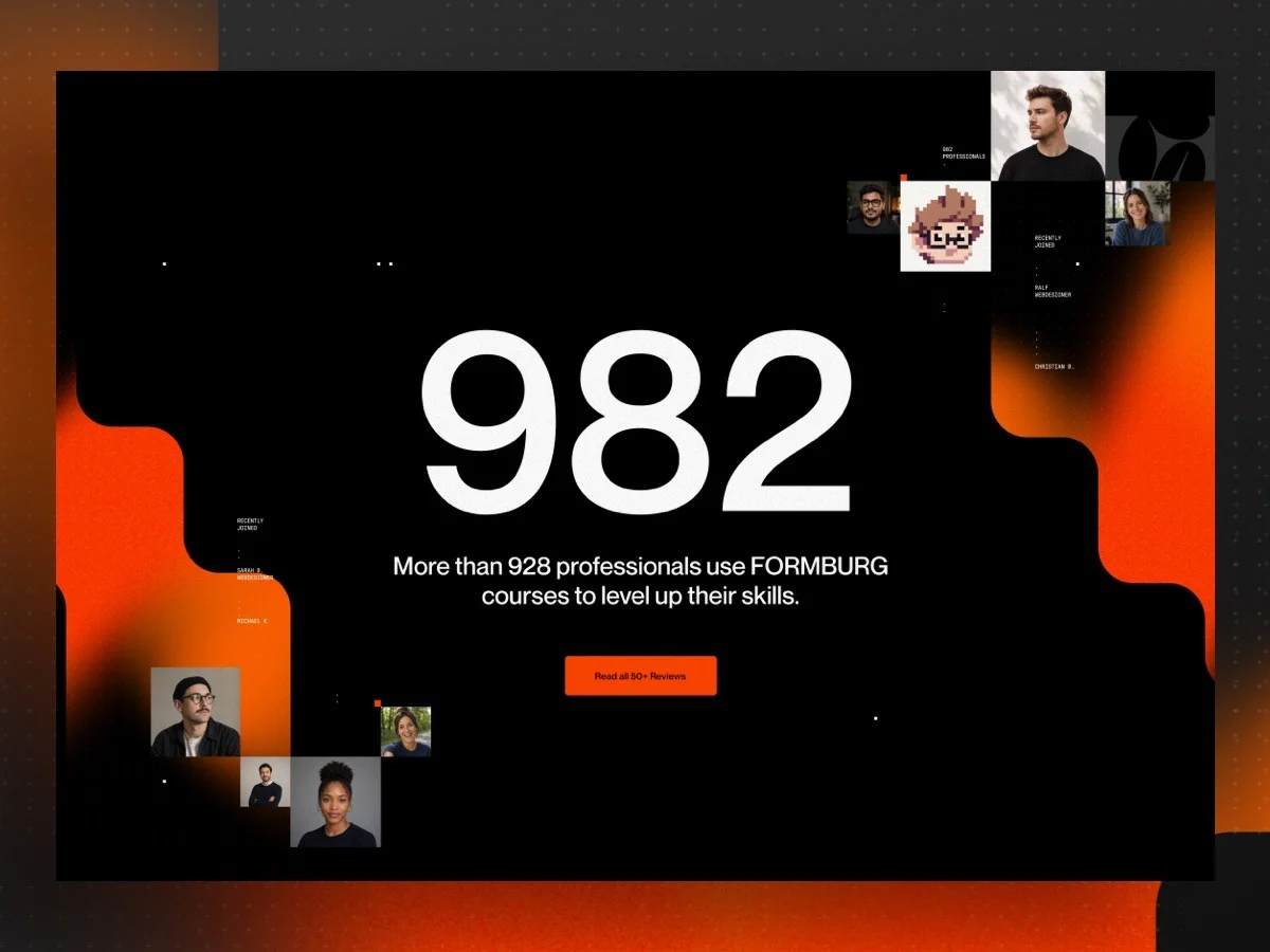
In crafting this section, I wanted to break the mold and create something that felt distinctively tailored, while still harnessing the power of Webflow's CMS capabilities.
This design integrates an engaging counter reminiscent of a slot machine, an artfully organized collage of individual portraits, and animations that consistently refresh the display of faces. With CMS data driving both the counter and the images, this section will morph over time without manual intervention.
The challenge arose in making all these moving parts work harmoniously. As Webflow’s Collection Lists naturally replicate the same layout for all items, modifying each portrait's size and position required some creative problem-solving.
To tackle this, I’ll outline the three core techniques that made this possible:
- A customizable counter with a slot-machine effect
- A collage of CMS-powered portraits arranged manually
- A smooth GSAP animation orchestrated via Webflow’s visual timeline
Tech Stack
- Webflow for overarching layout structure
- Webflow CMS for member profiles and counter dynamics
- CSS container queries + cqw and em units for responsive collage scaling
- A minimal JavaScript helper for counter functionality
- GSAP through Webflow’s visual timeline for fluid animation transitions
Part 1: The Counter
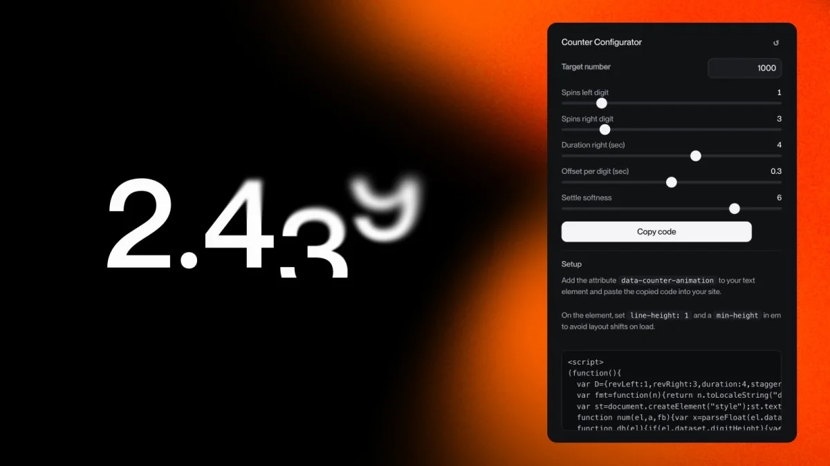
The counter is the highlight that first catches the viewer’s eye as they scroll. It needed to be engaging—think of a number spinning up like a casino slot machine. This value draws from a live CMS entry that updates monthly according to course sales. Amidst a busy layout, I aimed for the counter to take center stage, followed by the rest of the visual elements.
I'm not a JavaScript expert, so I’ve taken to using AI to generate the code I need. Years ago, I’d have scoured forums for snippets to tweak. Today, it’s a straightforward experience. The only tricky part was getting the easing right—ensuring the last digits decelerate gently to match the calm aesthetic of the whole section. Instead of relying on verbal adjustments, I now collaborate with the AI to create a small configurator where I can manipulate settings until I achieve the desired easing effect.
The settings I established for the counter informed the AI on how to generate the JavaScript. Given that I frequently need count-up animations for various projects, I've turned this into a free tool you can access and modify for your own needs: configure it, export the JS, and link it to a text element which dynamically pulls the number. Check out the Counter-Up Animation Generator →
Understanding the Script
I have a fundamental grasp of the code but I can’t discern if it's conventionally structured or if it employs clever techniques worth sharing. So, I had the AI highlight key concepts that render this script intriguing. Here’s a breakdown:
The main concept is to slide rather than count. Instead of animating from zero to the target number, the script constructs a vertical strip of digits for each place in the number:
- Each digit occupies a cell that's cropped to one line tall using
overflow: hidden. - The cell contains a strip of digits (0 to 9 repeated) with the target digit at the end.
- The strip slides upward using
transform: translateY, and because the cell crops everything else, viewers see the digits spinning until the desired one lands.
No counting logic is necessary—just a cropped, moving strip:
const e = 1 - Math.pow(1 - p, easePow); // ease-out: the element requiring most tuning
c.strip.style.transform =
  'translateY(' + -(e * c.steps * dh.unit) + dh.css + ')';
Three finer details ultimately enhanced the user experience:
Count from the right side instead of evenly distributing across the number. Locking in the leftmost digit first while allowing the rightmost digit to spin the longest offers consistency across numbers regardless of their length.
const right = chars.slice(idx + 1).filter((c) => /\d/.test(c)).length;
const dist  = total - 1 - right;
const f     = dist / maxDist;
const revs  = Math.max(1, Math.round(revLeft + (revRight - revLeft) * f));
Distinguish between “how many spins” and “duration.” An ease-out that starts swiftly feels frantic. By separating the two components (the number of revolutions versus how long they last), I gained precise control over the overall experience, represented by the sliders where I spent the most time refining the settings.
const steps = revs * 10 + final; // total distance covered by the digit
const myDur = Math.max(0.3, durRight - (maxDist - dist) * stagger); // time taken
Read the accurate line-height instead of using a hard-coded value like 1em. To cater to a tighter line-height: 0.9, the script identifies the actual line height using getComputedStyle, ensuring the strip moves in the appropriate measurement:
const cs = getComputedStyle(el);
const lh = cs.lineHeight;
const px = lh === 'normal' ? parseFloat(cs.fontSize) * 1.2 : parseFloat(lh);
The CMS integration involves a second, minimal script placed in the footer to read the actual number, exposing it globally. The counter waits for this signal along with an IntersectionObserver to ensure it activates only when in view, thereby executing seamlessly at the right moment, as seen in the earlier preview.
Part 2: Individual Collage Elements from Webflow CMS
The desired layout
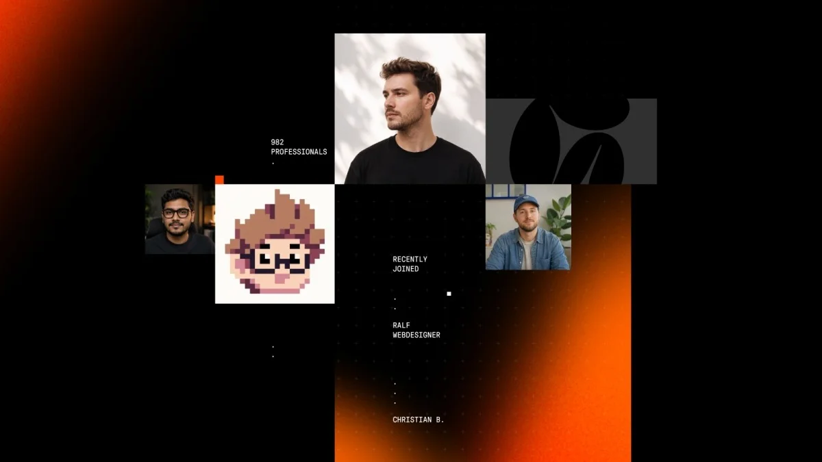
This is the area where many assume custom code or hacks are required, but I turned it into an engaging problem to solve.
Webflow positions itself as a user-friendly platform, yet it can limit custom arrangements. With four portraits of different sizes arranged like a collage sourced from a CMS Collection List, manually aligning them while retaining their unique positions becomes challenging. Webflow defaults to replicating every item uniformly, which flies in the face of my design needs.

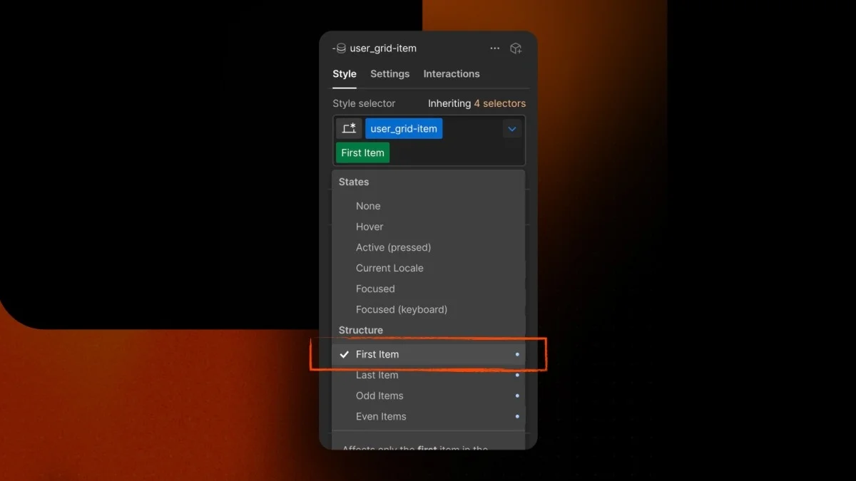
The breakthrough was realizing that I didn’t need to reorder items; I merely needed to style each position differently. Even though Webflow restricts direct control to only four options through its Designer interface:
- first child
- last child
- odd items
- even items
With just these four selectors, I managed to navigate the project without resorting to custom CSS, which was surprisingly effective.
Each portrait receives a defined width paired with vertical offsets for some, ensuring the portraits don't align flatly in a row:
/* base width for every item, then adjust per position, all in em */
.user_grid-item { width: 10em; }
.user_grid-item:first-child { width: 5em; margin-top: 10em; }
.user_grid-item:nth-child(even) { width: 8em; margin-top: 10em; }
.user_grid-item:last-child { width: 6em; }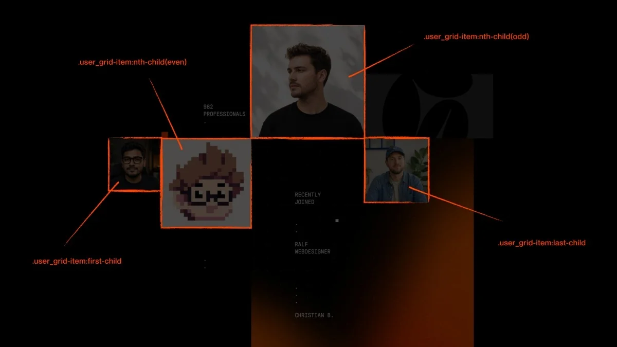
Previously, you might have noticed that Webflow assigns the same label and role text beneath each item, thus repeating content across the collection. My use of child selectors allowed me to hide all labels by default and only display a single label per collage, choosing strategic placements for visibility.
.user_grid-item-name { display: none; }
.user_grid-list .w-dyn-item:nth-child(3) .user_grid-item-name { display: block; }
Scaling Layouts with em Units
Many who follow my tutorials have noticed that I often utilize em units, yet haven’t fully integrated them into their own methods. This layout serves as an excellent example of the advantages.
The strategy: keeping every value within the user_grid-wrapper in em units allows for easy scaling of the entire layout simply by adjusting the font-size of the wrapper. Hence, all items adjust proportionally.
This is how it’s orchestrated:
- The wrapper gets a
container-type: inline-size, a custom property added via Webflow, which isn't available in the regular style panel. This makes the wrapper’s width the reference for theemvalues included in it. - Its
font-sizeis set to1cqw, equaling one percent of its width. - Since
emis relative to the font-size,1emnow represents one percent of the wrapper’s width, scaling items such that a 10em element is 10% of the wrapper's total. - The
user_grid-wrapperfits within my main page container, which also has a maximum width.
.user_grid-wrapper {
  container-type: inline-size;
  font-size: 1cqw; /* 1% of the container width */
}
/* items in em will automatically scale with the wrapper */
.user_grid-item { width: 10em; } /* = 10% of the container width */
As a result, all four CMS Collection items scale uniformly alongside the gradient background, which is ideal for a graphic of this nature. By updating the base font-size, the entire collage resizes cohesively.
This strategy streamlines resizing, particularly for responsive designs. During mobile and tablet breakpoints, I simply switch from cqw to vw, and since the page container maintains full width there, one vw matches one cqw. I promptly designate the collage as 2vw for immediate scaling, ensuring a coherent layout.
Part 3: A Looping Animation Using GSAP via Webflow's Timeline
For animating the visuals, I employed GSAP through Webflow’s cutting-edge visual timeline, which enables the creation of authentic GSAP animations directly in the Designer without needing to manually write any GSAP code.
Before initiating any animations, I carefully conceive their sequence. Positioned centrally, the animation requires a compelling start to draw visitors in without overwhelming them, as the layout is rich with intricate details that may lose attention if everything animates simultaneously. Thus, the counter spins first, followed by gradual appearances of collage items. A significant part of my effort was aligning the timings properly: determining the counter's duration and when the collage faces start rotating leads to a captivating but not laborious viewing experience.
Additionally, the gradient mask shapes scale, adding an extra dimensional flair to the movement.
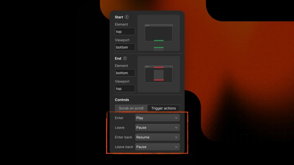
One best practice I implemented was to trigger the timeline when the section enters view, pause it when leaving, and resume on return scrolling. This keeps animations from running unnecessarily in the background, thus elevating overall performance.
The 3D Member Loop Effect
The loop effect for the member portraits takes center stage within this animation. Anticipating the flow of real-time member data means I need the faces to swap instead of a static display. Thus, I had to establish animations that serve both the incoming and outgoing members, contributing to a sophisticated appearance when elements stagger out. The approach is straightforward: each Collection List is layered twice within the section, with the second list positioned absolute atop the first one, skipping through the collection to showcase different faces. The animations alternate between elements sliding down and new ones upward.
To enhance the visual appeal, I applied perspective to the animation. A simple rotateX looks flat; adding perspective offers a sense of depth. The beauty of this technique is that you can adjust perspective and origin directly in GSAP's UI while bypassing the need for initial 3D setup in Webflow.
As I finalize the animation for the incoming images...