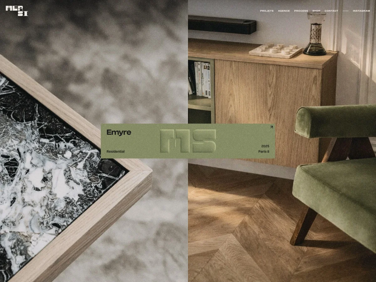
MERSI, a Parisian architectural firm known for its visually striking projects, approached us with a pressing need: to redesign a website that aptly reflected their high standards and artistic vision.
The transformation was extensive — we didn’t just give the website a new look; we redefined its entire digital identity. This involved reimagining visual aesthetics, enhancing user interactions, and building a custom interface that embodies the studio's artistic essence.
Moving Beyond Templates
When MERSI reached out, their existing site felt more like a hindrance than an advantage. It was fashioned from a generic Webflow template, which imposed both technical restrictions and financial obligations that ultimately stifled creativity.
The visual identity created by this template did not capture the studio's unique sensibility. Similar templates cluttered the web, making their work feel lost in a sea of sameness — a stark mismatch for a studio where precision and imagery are paramount.
This misalignment led to a lack of internal advocacy for the website; it wasn't seen as a vital business asset or a proper showcase of their capabilities. Our mission was to restore their digital authority and ensure the new site would genuinely encapsulate MERSI's brand.
Preserving Familiarity with Webflow
It became clear early on that we would use Webflow as the foundational platform; MERSI’s familiarity with the tool was an asset we could build on. Our goal was not to negate Webflow itself, but to escape the confines of the generic template they were shackled to.
By reimagining the user experience and customizing every element — from layout and typography to the interactive features — we could transform the platform into a tailored CMS that aligned perfectly with MERSI’s vision. The template wasn’t the issue; it was the lack of customization that held them back.
Crafting a Subtle Brand Experience
An integral part of the redesign was a brand refresh that maintained MERSI’s existing logo, crafted by designer Morgane Tubiana. Rather than overhaul this key element, we built a refined visual language around their established identity.
The prior visual approach had overwhelmed their brand's quiet sophistication, leaning too heavily on aggressive colors and decorative motifs. MERSI desired a subtler direction — something that conveyed a sense of luxury characterized by restraint and confidence.
We aimed to strike a balance, creating an atmosphere that wouldn’t overshadow their projects. Rich textures and an editorial rhythm added depth, ensuring that the work itself remained the focal point without losing a sense of premium quality.
A Harmonious Visual Dialogue
The overall vision for the site was to merge the tactile experience of architectural books with the interactivity of digital media. Architecture has traditionally communicated through physical formats, with a deliberate rhythm in how images, space, and typography interact.
Our layouts drew inspiration from this visual language. Pages became curated experiences, treating images as integral parts of the narrative rather than mere content blocks. Meanwhile, we infused digital dynamics through movement and transitions, ensuring that the site felt alive while still preserving that architectural sensitivity.
What emerged was a calming, immersive visual architecture that offered users moments of delightful surprise, navigating seamlessly through MERSI's rich portfolio.